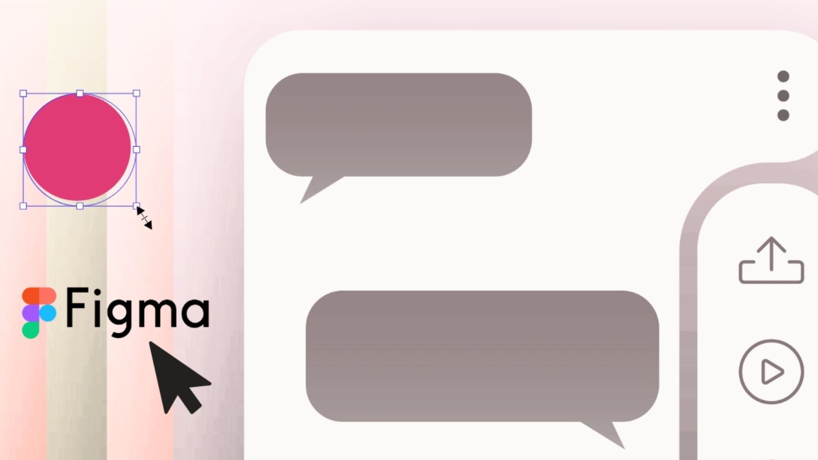
Figma to code quality assurance is one of the most important practical skills in modern frontend development.
You can spend hours building a polished interface with responsive layouts, working buttons and clean code, only to hear feedback like:
- “The spacing is off.”
- “The typography doesn’t match.”
- “The card looks taller than the Figma design.”
- “The button radius is wrong.”
At that point, the issue is no longer functionality, it’s accuracy.
In professional product development, “close enough” is rarely acceptable. Interfaces are expected to match the original design precisely, down to spacing, typography, sizing, alignment and visual consistency.
This is where Figma-to-code QA becomes essential.
In this guide, you’ll learn how professional engineering teams validate their implementations against Figma designs and achieve pixel-perfect UI accuracy. The workflow applies whether you are working with HTML, CSS, Tailwind CSS, React, Vue, Angular, Flutter or any other frontend technology.
Before exploring the tools and techniques, let’s first understand what Figma-to-code QA actually means.
What Is Figma to Code QA?
Before going deep into the technical process, first let’s understand what Figma to code QA actually means.
QA stands for Quality Assurance.
In software engineering, quality assurance means verifying that what you built behaves exactly the way it was originally designed.
When it comes to user interface development, Figma to code QA means comparing your live implementation against the original Figma design and checking whether every visual detail matches.
And when I say every detail, I literally mean everything.
For example:
If the designer used 24 pixels of spacing between two cards, your code should also render exactly 24 pixels.
If the heading uses 32px font size with 700 font weight and 40px line height, your browser should render the exact same values.
If a button has 12px corner radius, 1px border and 16px internal padding, those values should remain identical after implementation.
Professional teams don’t say:
“This looks close enough.”
They say:
“This matches the design specification.”
That difference separates junior implementation from production-quality frontend engineering.
Why Pixel Accuracy Matters
Many beginners think:
“Does one or two pixels really matter?”
Honestly?
Yes. More than you might imagine.
At first, a small spacing mismatch doesn’t seem like a big issue. Maybe your card is 4 pixels taller than the design. Maybe the button padding is slightly different.
Individually, these differences look harmless.
But when dozens of small mismatches start stacking together across an entire application, the product starts feeling… off.
Users may not consciously notice the issue, but subconsciously they do.
The interface starts feeling:
- Less polished
- Less premium
- Less trustworthy
- Less consistent
And trust plays a huge role in product design.
Imagine you’re using a banking app, an e-commerce platform or a SaaS dashboard. If buttons are inconsistent, text alignment feels strange and spacing looks random, users may start questioning the product quality even if the functionality works perfectly.
Pixel accuracy directly affects:
- User trust – Consistent interfaces feel professional. Professional products feel reliable.
- Brand perception – Companies spend thousands of dollars on design systems for a reason. Visual consistency builds brand identity.
- Development efficiency – When your UI matches the design the first time, designers don’t need to send endless revision requests.
- Team communication
Instead of vague comments like:
“Something feels weird…”
Teams can communicate with measurable precision:
“The padding should be 24px, not 16px.”
That makes collaboration dramatically faster.
Understanding Why Figma and Code Look Different
Now here’s a question many developers ask:
“If I copied all the values from Figma, why does my browser still look different?”
This is actually one of the most common frustrations in frontend development.
The answer is: Figma and browsers are completely different rendering environments.
Let’s break this down.
- Browser Default Styles
Every browser comes with built-in styling.
For example:
Buttons already have default padding.
Headings already have default margins.
Inputs already have default borders.
Lists already have indentation.
So even before your CSS loads, the browser is already making design decisions for you.
That’s why professional developers usually start with something called a CSS reset or normalize stylesheet.
Without resetting browser defaults, your UI will almost never match Figma exactly.
- Font Rendering Differences
This one surprises many developers.
The exact same font can look slightly different in:
- Chrome
- Safari
- Firefox
- Edge
- Windows
- macOS
Why?
Because each operating system and browser uses different font rendering engines.
This can affect:
- Character width
- Text sharpness
- Line spacing
- Kerning
That’s why typography often becomes one of the hardest parts of pixel-perfect implementation.
This environment gap is particularly noticeable when working with cutting-edge font files. If you find your text shifting unexpectedly during load, you can completely stabilize it by learning How to Fix Variable Font Rendering Issues in Modern Web Apps, which aligns your declarations directly with modern browser painting lifecycles.
- Developer Approximation
This is probably the biggest reason.
A designer specifies: 32px
A developer writes: 30px
Because it “looks close.”
Then the next spacing becomes 14 instead of 16.
Then border radius becomes 10 instead of 12.
Then shadow opacity becomes 15% instead of 20%.
Suddenly dozens of tiny approximations create a completely different product.
This is why guessing values is dangerous.
Always measure.
Tools You Need Before Starting
Now that we understand the problem, let’s talk about the tools professional’s use.
- Figma Inspect Panel
This is your source of truth. Inside Figma, the Inspect panel gives you exact values for:
- Width
- Height
- Padding
- Margin
- Font size
- Font weight
- Line height
- Colors
- Border radius
- Shadows
Never eyeball anything when Figma already gives you exact numbers. Professional developers live inside the Inspect panel.
- Browser Developer Tools
Your browser is your second source of truth. Open Chrome DevTools and inspect your elements.
This allows you to see:
Actual computed styles.
Not what your CSS says… But what the browser is actually rendering.
Sometimes your CSS says 32px…
But the browser renders 30.5px because of scaling.
DevTools helps catch these issues instantly.
- Pixel Overlay Extensions
This is where real pixel-perfect QA begins. Tools like:
- PerfectPixel
- PixelParallel
- Design Matcher
Allow you to place the original Figma design directly on top of your live browser.
Imagine placing tracing paper over your implementation.
Now every mismatch becomes obvious.
This is one of the most powerful techniques professional teams use.
Step-by-Step Figma to Code QA Process for 100% Pixel Accuracy
Step 1: Preparing Your Figma File Properly
Before writing code, your Figma file must be organized.
If the design file is messy, your implementation will be messy.
A clean Figma file should include:
Clearly named components.
For example:
- Bad: Button1
- Good: Primary Button / Default
Why?
Because names communicate intent. When developers see structured component names, implementation becomes faster. The file should also include:
- Auto-layout.
- Spacing rules.
- Responsive breakpoints.
- Typography tokens.
- Color tokens.
Without these, developers start making assumptions and assumptions create inconsistencies.
Step 2: Extracting Design Tokens
Before writing CSS, extract reusable values. This is called design token extraction.
Instead of hardcoding values randomly, define your system.
For example:
Typography:
- Heading Large = 32px
- Heading Medium = 24px
- Body = 16px
- Small Text = 14px
Spacing:
- XS = 4px
- SM = 8px
- MD = 16px
- LG = 24px
- XL = 32px
Colors:
- Primary = #2563EB
- Secondary = #1E293B
- Success = #16A34A
- Error = #DC2626
Why is this important?
Because once your design system exists, every page remains consistent.
Instead of guessing:
“Should this margin be 18px?”
You already know:
“Margins use spacing tokens only.”
That eliminates inconsistency completely.
Step 3: Building Your First UI Implementation
Now that your design tokens are ready, it’s finally time to start writing code.
This is where many developers get excited and immediately jump into building components. But here’s something professional teams always remember:
The goal is not to make it “look right.”
The goal is to make it “match exactly.”
That mindset changes everything.
Before writing complex interactions or animations, start with the visual foundation of your interface.
Begin by building:
- Page containers
- Navigation sections
- Cards
- Buttons
- Input fields
- Typography hierarchy
Focus purely on structure first.
For example, if your Figma design shows a card with:
- Width = 320px
- Height = 180px
- Padding = 24px
- Border radius = 12px
Your implementation should start with those exact values—not approximations.
Bad example:
“320 looks a little large… let’s make it 300.”
Good example:
“Figma says 320. We implement 320.”
This is where many pixel-perfect projects succeed or fail.
Also, avoid hardcoding random values directly into components.
Bad:
padding: 19px;
margin: 27px;
font-size: 15px;
Good:
padding: var(--space-lg);
margin: var(--space-xl);
font-size: var(--text-body);
Why?
Because design tokens create consistency.
If your designer changes the spacing system later, you update one token—not hundreds of components.
Professional teams don’t build screens. They build systems.
Step 4: Overlaying Figma on Your Live UI
Now comes one of the most powerful techniques in professional frontend QA.
This is where you stop trusting your eyes…
And start trusting measurements.
Even experienced developers can look at a UI and think:
“That looks perfect.”
Then they overlay the original design… And suddenly everything is off by 2 to 8 pixels.
This is why overlay comparison is so important. The process is simple.
First, export the original frame from Figma.
Usually as:
- PNG
- JPG
- High-resolution frame export
Then open your live implementation in the browser.
Using tools like:
- PerfectPixel
- PixelParallel
- Design Matcher
Place the exported Figma design directly on top of your webpage and reduce the overlay opacity to around 40–50%.
Now compare.
You’ll instantly spot issues like:
- Buttons shifted slightly left
- Incorrect padding
- Text blocks sitting too low
- Cards appearing taller
- Icons misaligned
This process removes guesswork completely.
Instead of asking:
“Does this feel centered?”
You ask:
“Does this mathematically align?”
That’s real QA.
Step 5: Checking Layout and Spacing
Once your overlay is active, the first thing you should validate is layout. Because spacing errors are the most common design-to-code issues. And small spacing errors quickly become visual chaos.
Start by checking:
External Margins
These are the spaces between major sections.
For example:
- Hero section to feature section
- Sidebar to content area
- Cards inside a grid
If Figma shows: 64px
Your implementation should also show: 64px
- Not 60.
- Not 68.
- Exactly 64.
Internal Padding
Now check spacing inside components.
For example:
Buttons may use:
- Top = 12px
- Bottom = 12px
- Left = 24px
- Right = 24px
Cards may use:
- 24px internal padding
Forms may use:
- 16px field spacing
Internal padding heavily affects visual balance. Even a 4-pixel error becomes noticeable.
Alignment
Next, check alignment.
Ask yourself:
Are all elements sitting on the same grid?
Check:
- Icon alignment
- Button alignment
- Text alignment
- Baseline alignment
- Center positioning
One misaligned icon can make an entire component feel unprofessional.
Professional developers zoom in. They don’t assume.
Step 6: Validating Typography
Typography is one of the hardest parts of pixel-perfect implementation.
Why?
Because even when your font size is correct, the browser may render text differently than Figma. That’s why typography QA needs special attention.
If you find your text scaling or weights breaking cross-platform, you can apply custom baseline and weight overrides by following our detailed guide on Fixing Font Weights & Typography Alignment in CSS (2026).
Start by checking:
Font Family
First, confirm the correct font is loading.
Sometimes developers accidentally use fallback fonts like:
- Arial
- Helvetica
- Sans-serif
Instead of the intended design font.
This immediately changes the look of the interface.
Always verify:
- Font family
- Font loading
- Font fallback order
Font Size
Now compare exact sizes.
For example:
Figma: 32px
Browser: Should also be 32px
- Not 30.
- Not 31.
- Exactly 32.
Font Weight
This is often overlooked.
Examples:
- 400 = Regular
- 500 = Medium
- 600 = Semi-bold
- 700 = Bold
Using 600 instead of 700 may seem minor…
But visually, it changes hierarchy.
Line Height
Line height affects readability.
If Figma says: 40px
Your browser should render: 40px
Too tight? Text feels cramped.
Too loose? Text feels disconnected.
Letter Spacing
This matters especially for:
- Buttons
- Navigation menus
- Labels
- Uppercase text
Even 0.5px difference can change the feel of a design.
Step 7: Checking Colors, Borders, and Shadows
Now let’s validate visual styling.
These details often separate amateur interfaces from premium ones.
Colors
Start by checking exact hex values.
For example:
Figma: #2563EB
Your code:
Should also be: #2563EB
Not:
- #2460E8
- rgb approximations
- “close enough” blue
Color consistency matters for branding.
Borders
Check:
- Border width
- Border style
- Border opacity
Example:
Figma: 1px solid #E5E7EB
Your implementation should match exactly.
Even a slightly darker border can make components feel heavier.
Border Radius
Rounded corners strongly affect product personality.
Examples:
- 4px = Sharp, professional
- 12px = Modern, friendly
- 24px = Soft, playful
If Figma says: 12px
Don’t implement 10px. Use exactly 12px.
Shadows
Shadows are frequently implemented incorrectly.
Check:
- X offset
- Y offset
- Blur
- Spread
- Opacity
A shadow may look “close”…
But small differences make components feel heavier or flatter. Always inspect shadow values carefully.
Step 8: Responsive QA Across Devices
Pixel-perfect doesn’t end at desktop.
Your UI must remain accurate across every screen size.
Now test:
Desktop
Check:
- Layout width
- Grid spacing
- Sidebar alignment
- Header positioning
Tablet
Check:
- Component stacking
- Horizontal padding
- Typography scaling
Mobile
Check:
- Button tap areas
- Text readability
- Card spacing
- Navigation behavior
Many developers only QA desktop…
Then mobile users get a completely different experience. Professional teams test every breakpoint.
Step 9: Testing Interactive States
A design isn’t just static.
Real products respond to users.
That means your QA process must include interactive states.
Check:
Hover States
Does the button hover state match Figma?
Check:
- Color transitions
- Shadow changes
- Border changes
Active States
When clicked: Does the component behave as designed?
Focus States
For accessibility: Can keyboard users clearly see focus indicators?
Disabled States
Are disabled buttons visually distinct?
Can users understand they’re inactive?
Loading States
Do loaders, skeleton screens, and spinners match the design system?
Many developers’ perfect static screens…
Then forget interactions entirely. Professional QA covers both.
Final Pixel Perfect Checklist
Now we’ve reached the final stage of our Figma to code QA process.
At this point, your UI may already look visually perfect. Your spacing feels right, your typography looks clean, and your components appear consistent.
But before shipping your interface to production, professional teams always run through one final checklist.
Why?
Because even after hours of development, tiny visual issues can still hide in plain sight.
- A 2-pixel margin error.
- A wrong font weight.
- A missing hover state.
- A shadow with incorrect opacity.
These small mistakes may seem harmless, but in production, they can affect user trust, design consistency, and overall product quality.
So before you mark your task as complete, go through this checklist carefully.
Layout and Structure
Ask yourself:
✅ Does every section align with the original Figma grid?
✅ Are containers using the correct widths and max-width values?
✅ Are cards, buttons, inputs, and images positioned exactly where they should be?
✅ Are all horizontal and vertical alignments consistent?
✅ Does the layout maintain visual balance across the entire page?
Even one misaligned component can break the professional feel of an interface.
Spacing and Sizing
Now verify all spacing values.
✅ Are margins identical to the Figma design?
✅ Is internal padding correct inside buttons, cards, and form fields?
✅ Are icons, text blocks, and images spaced consistently?
✅ Are widths and heights matching the design specification?
✅ Did you avoid random spacing values outside your design token system?
Remember:
Professional UI never uses “whatever looks okay.” Professional UI uses systems.
Typography
Now check text carefully.
✅ Is the correct font family loaded?
✅ Are font sizes identical to the design?
✅ Are font weights correct?
✅ Is line height matching the Figma specification?
✅ Is letter spacing correct for buttons, labels, and headings?
Typography is one of the first things users subconsciously notice.
Colors and Visual Styling
Now inspect your visual details.
✅ Do all colors match the exact design tokens?
✅ Are border colors and opacity values correct?
✅ Are border radiuses identical to Figma?
✅ Are shadows using the correct blur, spread, and opacity values?
✅ Are gradients, overlays, and transparency effects implemented accurately?
Small visual inconsistencies often hide here.
Responsive Behavior
Resize your browser and test.
✅ Does the desktop layout match the desktop frame?
✅ Does the tablet layout stack correctly?
✅ Does the mobile version remain readable and usable?
✅ Are buttons large enough for touch interaction?
✅ Does spacing scale properly across breakpoints?
Pixel-perfect means every screen—not just desktop.
Interactive States
Now interact with every component.
✅ Hover states match the design
✅ Active states behave correctly
✅ Focus states support accessibility
✅ Disabled states are visually clear
✅ Loading states match the design system
A static UI may look perfect… But users experience interactions.
Cross-Browser Testing
Finally, test your implementation in multiple browsers.
- Chrome
- Firefox
- Safari
- Edge
Check:
- Font rendering
- Spacing
- Layout behavior
- Animations
- Input styling
Because pixel-perfect in Chrome alone is not pixel-perfect.
If every box above is checked… Congratulations.
Your UI is ready for production.
Not “close enough.”
Not “looks fine.”
Pixel perfect.
End of the Lesson
Achieving a pixel-perfect interface is not about obsessing over tiny details for no reason, it’s about delivering consistent, professional and trustworthy user experiences.
By incorporating proper Figma-to-code QA into your workflow, you can catch visual inconsistencies early, improve collaboration with designers, and build interfaces that accurately reflect the intended design system.
The more you practice comparing designs, validating spacing, checking typography, and testing responsiveness, the faster and more precise your frontend implementation process will become.
Use the techniques, tools, and checklists covered in this guide as part of your regular development workflow, and over time, pixel-perfect implementation will become second nature.

I’m a Mechatronics Engineering enthusiast and tech writer who believes intelligent systems should be understandable to everyone. I’m passionate about robotics, embedded systems, and AI-driven automation—and even more passionate about breaking down how they work into clear, compelling stories. By blending hands-on engineering experience with thoughtful writing, I help readers connect with the technology shaping our future.


Leave a Reply